World Development Indicators (2022)
A Short Exploratory Data Analysis with Quarto
2026-02-25
Overview
In this presentation, I analyze a 2022 sample of the World Development Indicators (WDI) dataset from the World Bank (World Bank 2022).
Goals - Load and clean the dataset (wdi.csv) - Explore a few core development indicators - Visualize patterns across countries - Summarize results with a small statistics table
Data + Indicators
The dataset contains country-level measurements for 2022.
For this mini-analysis, I focus on:
- GDP per capita (income level proxy)
- Life expectancy (health outcome)
- Unemployment rate (labor market outcome)
These are commonly used indicators for comparing development outcomes across countries.
Quick Descriptives
A first step in EDA is checking the distribution and missingness. Below are basic summary statistics for the three key indicators.
| count |
203.000000 |
209.000000 |
186.000000 |
| mean |
20345.707649 |
72.416519 |
7.268661 |
| std |
31308.942225 |
7.713322 |
5.827726 |
| min |
259.025031 |
52.997000 |
0.130000 |
| 25% |
2570.563284 |
66.782000 |
3.500750 |
| 50% |
7587.588173 |
73.514634 |
5.537500 |
| 75% |
25982.630050 |
78.475000 |
9.455250 |
| max |
240862.182448 |
85.377000 |
37.852000 |
Interpretation
GDP per capita usually has a very wide range across countries.
Life expectancy varies less than income but still meaningfully.
Unemployment rates can differ sharply between countries with similar income.
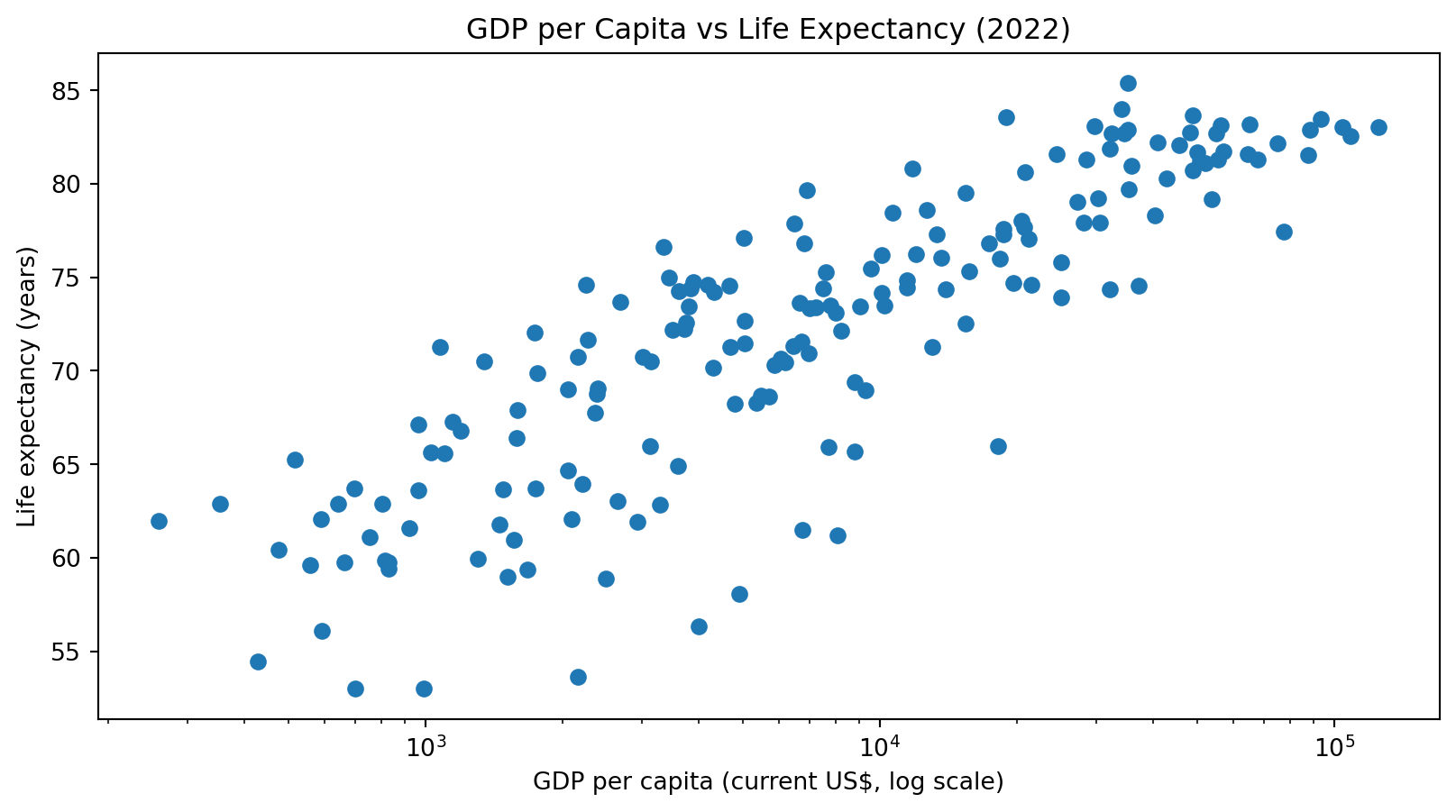
Relationship: Income and Health
Many cross-country comparisons show that higher income tends to be associated with higher life expectancy. This is closely related to the classic “Preston curve” idea (Preston 1975).
Description
The x-axis is log-scaled so both low- and high-income countries are visible.
The overall pattern is upward: richer countries tend to have higher life expectancy.
There is still large variation, meaning income is not the only factor.
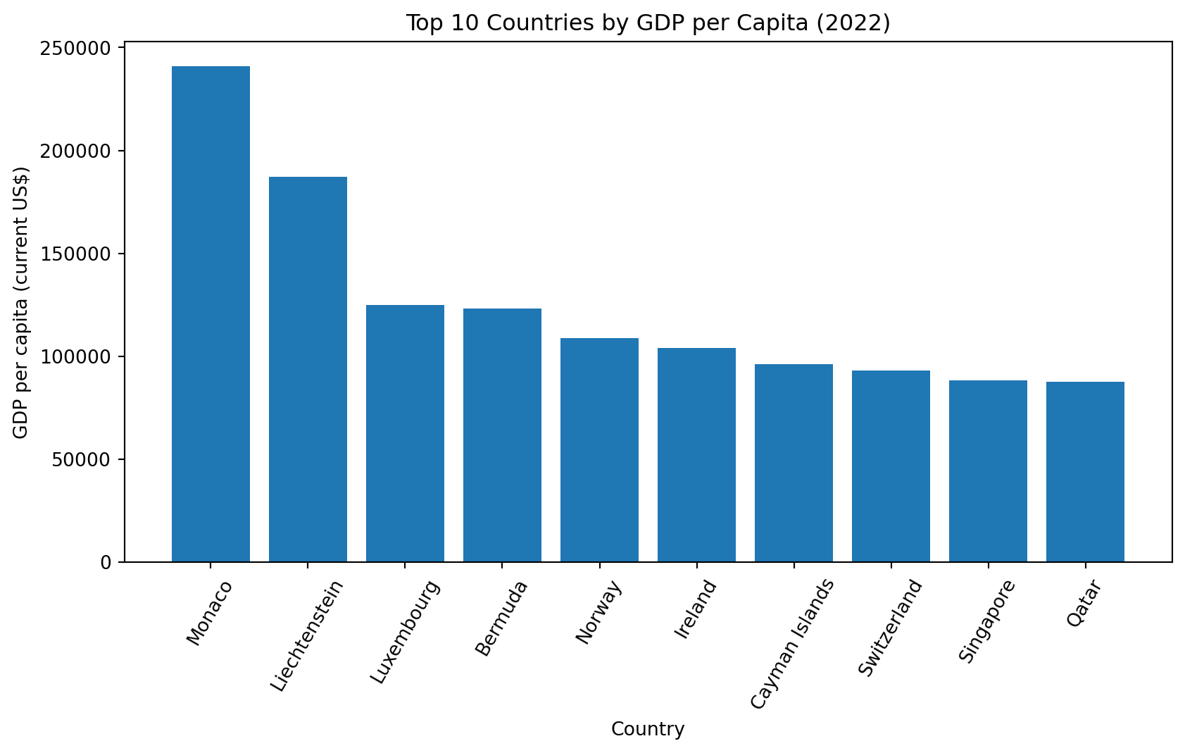
Distribution: Top 10 by GDP per Capita
Next, I compare the most extreme values by looking at the top 10 countries in GDP per capita.
Description
This plot highlights how concentrated the right tail of the income distribution is.
A small set of countries sit far above the global median.
Summary Table: Key Statistics
This table summarizes the same three indicators using common descriptive stats.
| gdp_per_capita |
179.0 |
17358.17 |
23532.14 |
259.03 |
6810.11 |
125006.02 |
| life_expectancy |
179.0 |
72.17 |
7.86 |
53.00 |
73.44 |
85.38 |
| unemployment_rate |
179.0 |
7.25 |
5.87 |
0.13 |
5.50 |
37.85 |
Description
GDP per capita has the largest spread (big std and max–min range).
Life expectancy tends to cluster more tightly.
Unemployment varies a lot across countries and may reflect economic structure and policy.
Main Takeaways
Income and health are positively related: countries with higher GDP per capita generally have higher life expectancy (log-scale helps show this clearly).
Income distribution is highly skewed: the highest-income countries stand out strongly.
Unemployment varies widely even among countries that look similar by income.
Data source: World Bank WDI (2022 extract) (World Bank 2022) Concept reference: Preston curve (Preston 1975)